Well, award season is nearly wrapped up and the summer blockbuster season is still more than a month away.
So. How about movie studio logos? Now I wouldn’t say this holds much merit when it comes to cinema as an art form. In fact, it doesn’t really matter in the grand scheme. However, despite that, they tend to leave a big impact. Many of them are memorable, and they stick with a person because they’re made to.
This has been on my mind for a while now, and not for a particularly good reason. See, not long ago I watched and reviewed the film “Protector.” Not a great film, but one thing I noticed was how it started. The movie had not one. Not two. Not three. But six studio logos to get things started.
This is usually the case with smaller films, which draw resources and investments from multiple sources, often different companies, which put their stamp at the start of the flick. An even better recent example than this was the charming 2024 horror flick “Late Night with the Devil.”
That movie had a whopping nine studio logos to get started. That beat out the 1990s anime classic “End of Evangelion,” which had eight of them. Regardless of whether there’s half a dozen or just two, though, there is some level of creativity that goes into these short pieces of media.
The Big Boys
Probably the best place to start in this exploration is with the major players. Today, there are five, but for many of us, we remember six: Universal, Paramount, Warner Bros., Walt Disney, Sony and 20th Century Fox. The last one, of course, has since been acquired by the Mouse House.
All of them, though, are memorable. Each has a grandiose vibe, thanks to both their increasingly elaborate presentation and the accompanying fanfare. In the past, many of these presentations were simply posting an image of the logos. This was especially true with Paramount and Warner Bros.
But in more recent years, that’s changed. Since 2000, Paramount now begins with a sweeping set of stars crossing a distance before revolving around a mountain. WB, meanwhile, shows an image of the studio’s famed water tower before dissolving in the company’s animated logo.
Both offer a great deal of scale: Paramount’s towering mountain and the shine from the gold WB trim. They’re iconic images, and the extended animation enhances the studio identity. They certainly weren’t the first to offer elaborate introductions, though. For many years, the FOX logo was presented with an incredibly memorable music cue along with waving searchlights.
This is something that goes back to the 1930s, but it didn’t stay stagnant. In the 1990s the logo began to be displayed with a sweeping camera movement around the logo to create an even greater effect. Unfortunately, while we still get an updated 20th Century Studios spot, the acquisition by Disney has lessened the impact.
Speaking of which, Disney is one that for years felt simple. The presentation of a castle with a shooting star flying over. Then, in the late 2000s, they started making it more expansive. Today, it’s a revolving display around a massive castle. It gets a viewer ready for some whimsey, especially before family pictures.
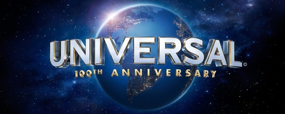
The one that’s always been creative and left a massive impression, though, is Universal’s. The view of the Earth gives an all-encompassing feel to what’s going to follow the logo, regardless of what genre may be coming up. The latest version is quite powerful, especially with that “Dunn Dunn” that is part of the music.
As for Sony, eh. It’s not exactly memorable. I appreciate it being short and to the point, but there’s not much there.
Prestige
Sony has a simple presentation, and Sony Pictures Classics is even more so. It’s simply the studio name, in white, against a light blue backdrop. And I absolutely love it. Now, that may be because eight of its releases have made my top 10 list at the end of the year, meaning the studio at least releases a top tier movie every other year.
However, that’s sort of the point. It’s a logo that lets the ensuing movie do the talking. That’s not to say no thought went into it, though. The light blue is an inviting color, and the script being capitalized in a tight font give it a sense of soft power. It’s somewhat similar to another studio, A24.
This one has a more active presentation, with the letter and numbers formed in an animation. But again, it’s an uncomplicated showing. However, like Sony Classics, it lets its movie do the talking. This is a studio that’s managed to have a movie in either my Top 10 list or honorable mentions annually since 2015.
That’s not to say all the award chasing companies need to be uncomplicated. Searchlight Pictures, formerly including FOX at the front, works by having the fanfare, but with a slightly different color scheme. The gold is more matte and there’s a panning shot of Hollywood with darker lighting going before the logo. There’s a sense that it’s more of a special, intimate screening about to debut compared to its grander counterpart.
Other indie studios used to exist under the big banners, but have since gone defunct. One example is Paramount Classic, which then transitioned to Paramount Vantage. Both had great opening logos. Paramount Classics screamed prestige with its classic mountain behind the studio’s artful gate that actually sits on the Hollywood lot. Its successor, meanwhile, gave the ensuing a film a sort of underground vibe.
Warner Independent, meanwhile, was less sensational, but still fairly effective, having the “B” fade and an “I” form in the middle. Universal’s more indie studio, Focus Features still exists, but it it’s never really done much for me. I know a great movie is very likely coming up when I see it, but it just doesn’t carry the same visual weight as others.
Mid Majors
There are so many good smaller studio logos out there in the business of producing and distributing. One of the most iconic is Metro-Goldwyn Mayer, the lion one. I love how the recent version has included the translation of Ars Gratia Artis on its outline, which means Art for Art’s Sake. Mixed with the roar and it’s spot on.
Another great, long-running company logo is from Amblin. There’s a brilliant fanfare as Elliott and E.T. zoom with Moon in the background. I would purposefully watch the credits of “E.T.” just to see this logo after. Yes, ladies and gentlemen, this is what I considered a stinger. Marvel, eat your heart out.
One that’s gone through a few changes over the years is Lionsgate. It began as a constellation of a Lion, before transitioning to this huge gothic door with many clinking gears behind a key hole. My guess is that was just so they could use a red variant for horror films. However, in the 2010s, (after the “Saw” franchise ran out of steam by the way), it went back to its more star-filed constellation. Personally, I think it’s a better fit for the studio.
New Line Cinema is another iconic display and it’s one I appreciate. That’s partially because I have good memories of hearing the “Mortal Kombat” theme over it, but regardless, it just looks good. Hard to be more cinema than a film reel, plus that blue shining light behind makes it work. However, I will add a caveat that the original New Line Cinema logo all in black and red was fantastic, too.
Another one that went away for a while but returned with fury in its output is Orion. A very space-themed logo, it often had a good fanfare and script that looked like it was made by stars. After hitting a rough patch in the 1990s, it was revived in the 2010s and came back with a better logo, now like a celestial creation. The movies, such as “American Fiction” and “Women Talking,” have been great to boot.
Aside from those, a few notable logos include Castle Rock Entertainment, Columbia and TriStar. Though we sadly don’t see the pegasus much anymore.
Those aren’t the only logos I’ve appreciated, so lets’ do a bit of a lightning round:
Atomic Monster is a newer studio and its track record has been up and down. The company’s highlight is without a doubt “Malignant.” But regardless, the logo always lends some hope, thanks to its genre film vibe.
Jerry Bruckheimer Films. Intense, an open road in stormy conditions, fast paced and all leading up to a lightning strike. It prepares a person for what’s likely going to be a thrill ride. And that’s what audiences have gotten with the likes of “Enemy of the State,” “Pirates of the Caribbean” and “Top Gun Maverick.”
Sadly, Film District, which released the stellar “Drive” and the entertaining “Olympus Has Fallen,” is out of business. However, it was a solid presentation, giving this sort of dream like world where movies create magic.
Mandalay Pictures feels like the more chill alternative to MGM. Rather than a loud lion roaring surrounded by gold, Mandalay features a tiger calmly, but confidently, in his jungle element. It’s simpler, but no less dramatic. There also happens to be a Mandalay Bay and MGM Grand in Las Vegas, too. Huh. Anyways, it’s put out some good stuff over the years like “Bernie,” “Air” and “Highest 2 Lowest.”
Neon wins me over because, well I like neon. I like neon colors, and I like neon signs. One of my favorite things to see in sports bars are some good neon displays combining beer and athletic team logos. That means the Neon logo earns automatic points, and the electric sound with it is fantastic.
Plus, the movies have been great. In 2025 alone it put out Top 10 list members “No Other Choice” and “Sentimental Value.” In 2021, meanwhile, it put out my No. 1 and No. 2 films, “Spencer” and “Pig.”
TSG Entertainment is involved with a variety of genres and it’s usually a good sign to see before movies. First of all, it’s just cool seeing the archer shoot an arrow through several axes. Plus, it’s been behind many good movies. Lately, it’s been attached to “Rental Family,” “Kinds of Kindness,” “Poor Things” and “The Banshees of Inisherin,” on top of several good action flicks.

One thought on “The art of movie studio logos”